Jaguar’s “Copy Nothing” campaign analysis
An impartial analysis so the politics doesn’t distract us.


Jaguar’s rebranding campaign has sparked an interesting conversation, blending politics, consumers’ increasing vocal opinions about brands, and valid design and semiotics critiques.
I want to share my perspective—because politics are indifferent to me, and I feel they distract from the objective points worth critiquing.
To start, Jaguar has never been, nor will it ever be, in my top 10 most desired or well-positioned car brands. To me, Jaguar has always felt like a neutral brand, perhaps historically a bit machista—the James Bond car and so on. Maybe that’s why it never resonated with me—not because it was machista, but because it was machista in the same way countless other brands were at the time, albeit a bit more basic.
So, the premise of “Copy Nothing” hasn’t held true in the past and remains unmet with this campaign. Jaguar copies so much that you’re left questioning how many biases were involved for that to be the slogan.
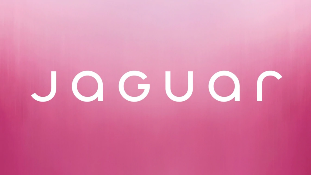
Jaguar’s new logotype in 2024
Let’s begin with the new typography, the gateway to the broader criticism. What Jaguar did wasn’t a brand evolution; it was a complete overhaul—a rebranding. Was it necessary? Not really. Some markets demand constant exploration of how a brand can better align with present trends. Luxury cars with such a storied history? Probably not in that group.
The break is stark. Not only is the new design uninspiring and lacking the strength to communicate a new identity, but it also includes details some might consider mistakes, like mixing uppercase and lowercase letters. All of this makes for a design lacking solidity. Thanks to the symmetrical rhythm and balance of the letters, it doesn’t appear optically unbalanced—but subliminally, it is.
The typography and spacing result in something very basic and predictable. The font used is geometric (Futura-like), which isn’t inherently bad, but it has a flaw: they all look alike. As a result, the typography fails to convey identity because “we’ve seen that font somewhere else before.” I even recall seeing something similar among the thousands of fonts I’ve encountered as a designer, but neither FontSquirrel nor MyFonts could find a perfect match.
If the font is unique and original, how does it, in its entirety and through specific details, evoke so many associations with other brands simultaneously? Gucci, Google, Ubuntu, Adidas, Cisco, Calvin Klein, Chanel. See the pattern? It’s trying to align with a fashion brand. However, being in the automotive industry, it feels more like something a small electric car startup in the Far East would adopt. And there, the logo would work perfectly. Maybe Jaguar’s parent company, Tata, had some influence.
No, seriously, the graphic symbol with arguably the most recognition is the leaping jaguar silhouette. Surely, the design team isn’t so out of touch with reality that they simply forgot to include the mascot, right? And not just the brand’s mascot, but practically the internet’s mascot as well. There are other branding elements that feature the jaguar, but its absence from the main logo is truly noticeable.
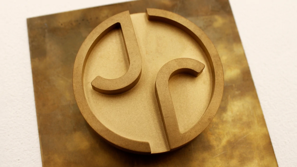
On the other hand, the monogram isn’t that bad—completely predictable and obvious, leveraging the same graphic element for both the J and the R. You’d need to see it on the car to be sure how well it works. However, it isn’t entirely free of the geometric legacy of the logo. Yes, it’s the kind of logo you’d imagine on a wallet or a belt buckle.
If someone told me, “Jaguar is branching into the fashion industry,” and showed me the new identity, I’d say it works brilliantly and makes sense to separate it from the original brand. But I don’t think that’s what Jaguar wants—or maybe it is; who knows, it could be in the plans. Even so, discarding all the original brand equity wasn’t necessary.
Jaguar aims to enter the electric car market, and perhaps the strategy is to gradually steer the brand toward what the new industrial and conceptual car designs would represent. But then, why not wait until they have the product to launch the new brand? Maybe that way, it’d be clearer what they aspire to be.
It’s precisely the product (or lack thereof) that connects us to the most controversial aspect. Regardless of one’s stance on gender and identity debates—where’s the car? Why does this give me such “Hunger Games” vibes? It not only copies many clichés of this advertising style but also fails to tie them to the current product in a way that justifies the lack of creativity.
It reminds me of Girbaud campaigns from the late ’90s (which I personally adore as a massive fan of MfG). But here, it’s more of a token nod to diversity than something that validates or strengthens the product’s attributes. It completely overlooks the target market.
I’m not saying the target audience is just conservative men—it probably is—but that’s not the point. My point is that buying a luxury car is largely about using the vehicle as a means to express the owner’s capabilities and style. There’s a missing connection between that and the new graphic concept.
Without the product, this is just a photoshoot sponsored by Jaguar. Don’t get me wrong—I’d grab a beer with any of the models. I’d probably volunteer to be the designated driver, especially if we’re heading back in a Jaguar. Can a Jaguar even fit that many people?
Speaking of diversity—for a brand named after appropriating an animal that’s 100% original and emblematic of the New World, where’s the Latin@ representation? I’ve always thought “Jaguar” should, by rights, be the Mexican luxury car brand. Because of course they can, and that (beast 🤤) resembles more a Jaguar compared to what the British usually design.
In conclusion, an ambiguous and shaky rebranding that leaves you waiting for the product to make sense of the message. Maybe that was the goal? But it reminds us that in advertising, not all expectations are good, especially when it’s not clear that they were intentional.

Marketing and technological consultant passionate about business development with over 15 years of experience helping ideas and entrepreneurs to start their journeys from scratch. Lead service provider at creativo.io and founder at arcadia.global
 © WFGH 2011

Leave a Reply
Want to join the discussion?Feel free to contribute!